
Finding Leeuwin Coast's north star
Leeuwin Coast
Brand Strategy & Visual Identity
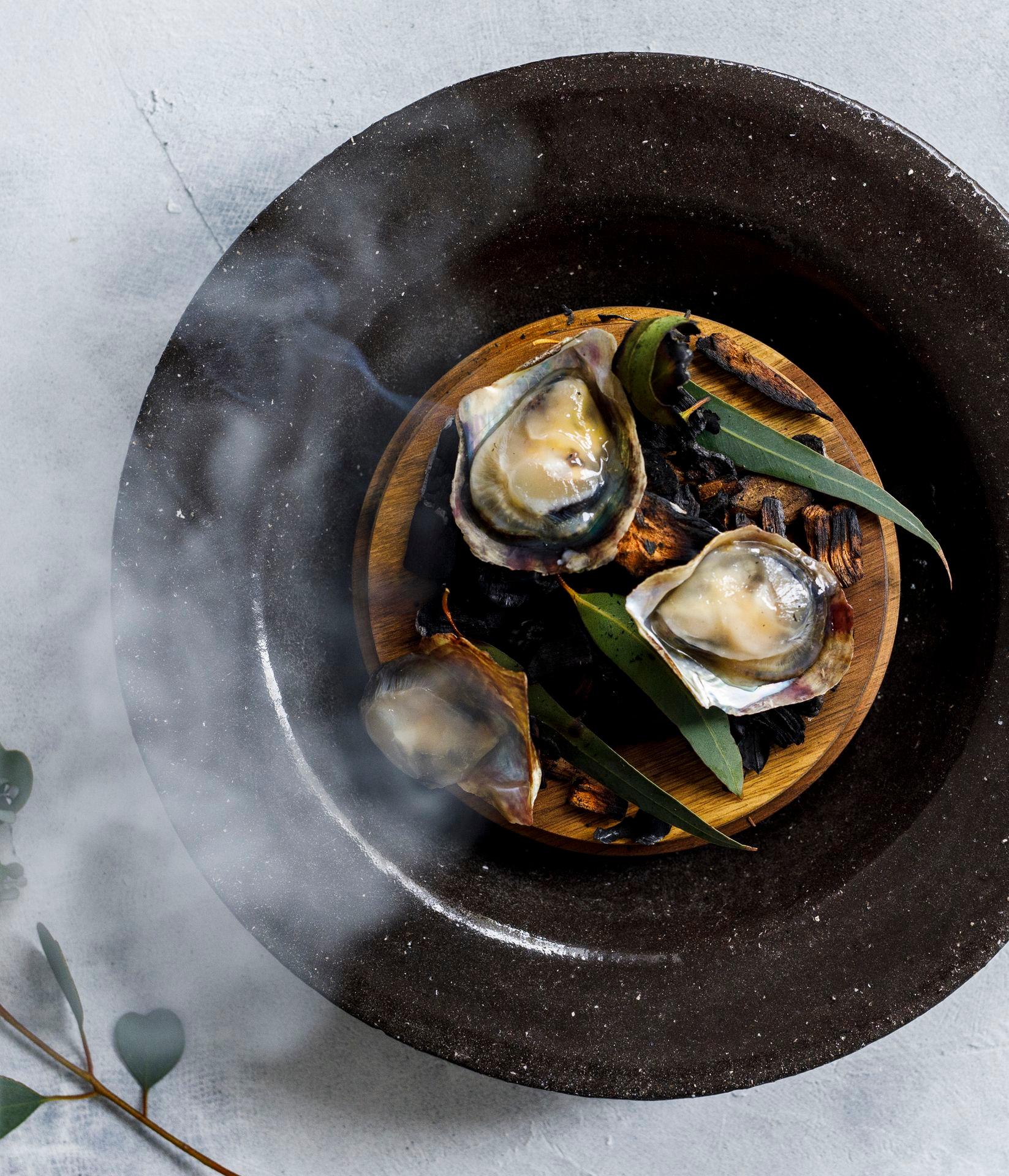
Leeuwin Coast’s dedicated team of rigorous and passionate individuals leverage their unmatched knowledge and expertise to cultivate Albany Rock Oysters and Akoya in the stunning Albany landscape. As they prepared to solidify their market presence, they sought a brand refresh, including a guiding principle and brand narrative to ensure alignment both internally and externally.
Project partners:
The Problem
How could Leeuwin Coast highlight their environmental commitment through their comms and visual identity?
Leeuwin Coast was preparing to launch the Akoya, a new shellfish from Western Australia, and recognised the need for a visual brand refresh.
To ensure the success of this launch, they sought strategic alignment not only for customer-facing communications but also to align staff internally with the same aims and objectives moving forward.
The Solution
The best seafood in the world, forever.
Through a series of stakeholder workshops a brand narrative was built, interrogated and implemented, emphasising premium quality and unwavering sustainability: “The best seafood in the world, forever.”
Design decisions didn't simply reflect this narrative; they were inherent in every choice, resulting in a comprehensive style guide that influenced everything from ink and material choices to the design process and digital sustainability—all within a tight budget.
The existing logo was enhanced with a new premium visual identity. 'Current lines' inspired by Western Australia's natural currents reflect Leeuwin Coast's rugged and pristine provenance.


